Overview
This is a design guide for Product Designers tasked with developing their product/app for a monocular device - smart glasses, wearables, etc. When I started, I found a few articles written by developers, but no guidelines for designers working on user experience, spec’ing UI and interactions.
For the past three years, my teammate Maddie and I have worked on deploying our legacy and current product across various form factors – mobile, web, desktop, monocular wearables and binocular AR glasses. Looking at monocular devices specifically, we’ve had the chance to optimize for Epson, GG1, Google Glass Enterprise Edition 2, Vuzix M300, M400 and the RealWear HMT-1. These glasses represent a range of size and interaction paradigms.
Here are some tips I wish I’d known when we started. At the end of this article I’ve included a list of questions I’d ask myself. Questions that will end up driving many of your interaction and visual decisions.
Knowing the specific wearable(s) you’re designing for is critical – and if you’re designing for more than one. Specific wearables will dictate what interactions are possible and which are preferable. How much you plan to optimize for a specific device will impact everything: UI, UX and interactions.
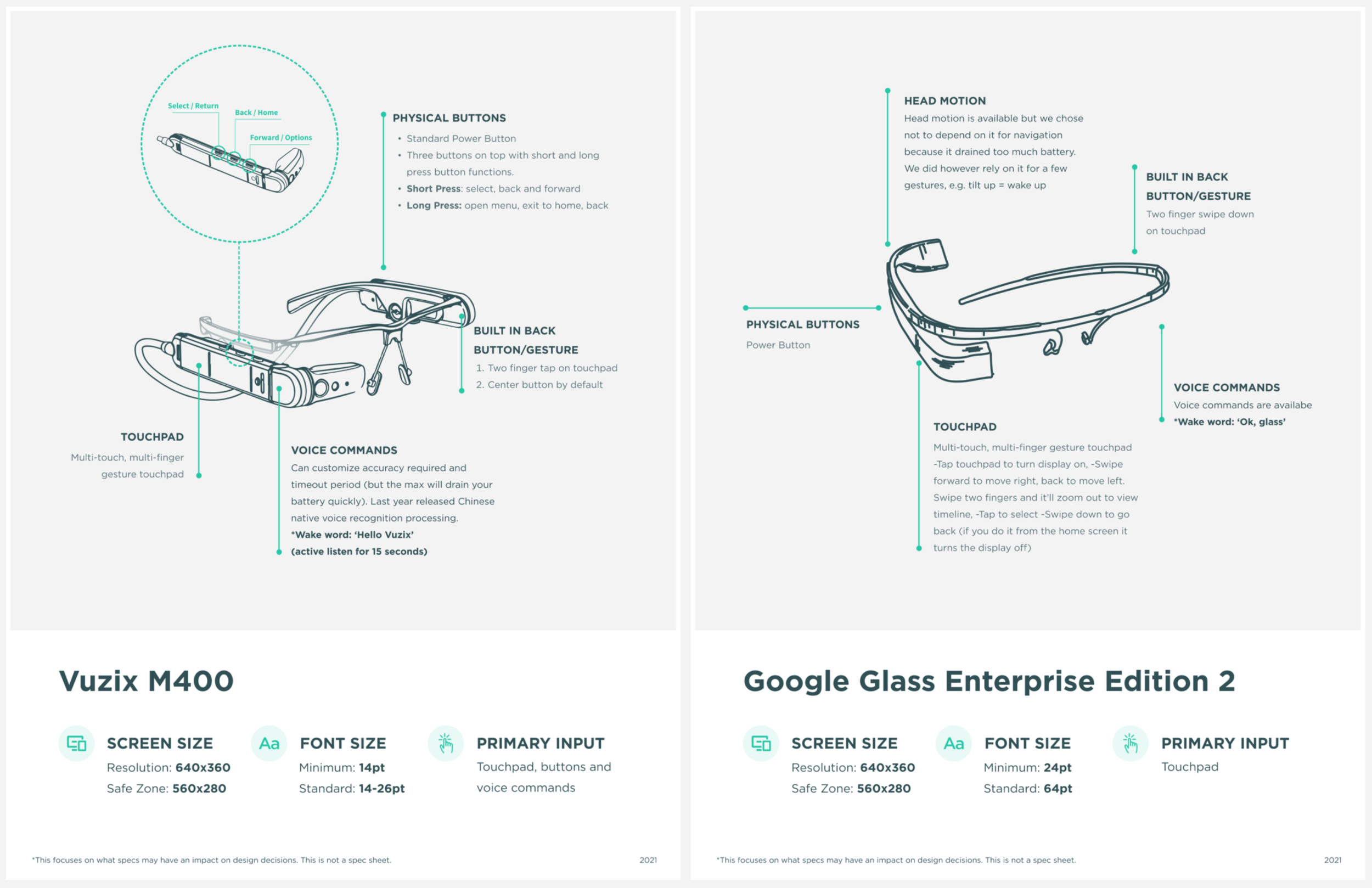
Take the example of these three monocular glasses:
All of these devices 1) are monocular, 2) can accept voice commands, 3) support touch interactions and 4) have a limited number of buttons. They also have inherent, divergent constraints that will have a significant impact on your design decisions, approach and solutions.
Screen size
Screen size alone will have a considerable impact on design decisions around almost all fundamentals: primary navigation, persistence of UI elements throughout the app, placement of primary and secondary actions, button styles, font sizes, back navigation requirements, etc.
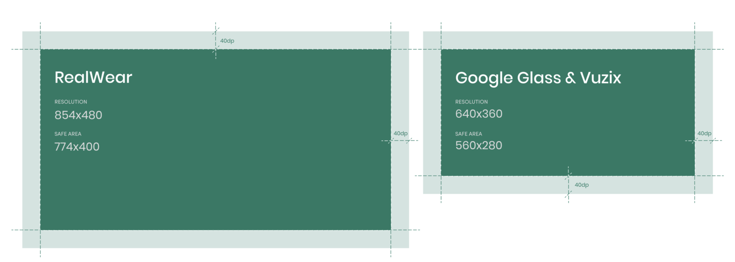
The screen size of the Vuzix M400 and Google Glass Enterprise Edition 2 are much smaller than the RealWear HMT-1. RealWear is larger at 854x480 and has a safe area of 774x400, whereas the Google Glass 2 and Vuzix have a display area of 640x360px (although guidelines suggest you have 40px of padding along the entire edge — so usable space can be as small as 560x280px). For these smaller devices, font size, UI components and labels need to be minimized as much as possible, while still maintaining accessibility. It’s helpful to drop your mobile screen components into an artboard or canvas to get a sense of the scale you’re dealing with. See device sizes in Figma.
Interaction Model
Selecting the primary mode is paramount, as it has arguably the most significant impact on the end-user’s experience. Does the device(s) support voice commands? Touchpad? Does it have distinct click buttons? Does it have a rocker or external remote? Does it support head motion?
For example, RealWear is best experienced using voice commands, so much so that the entire design is approached with their “Say What You See” paradigm in mind – meaning best practice is to provide persistent labels that indicate an available command. RealWear devices don’t even require a wake word… which is why you’ll want to make sure your commands are multisyllabic 🙂.
Vuzix and Google Glass both support voice commands but the experience is less dependable than on RealWear, leading us to rely primarily on the touchpad for interactions.
1. Registration Screen Primary Actions
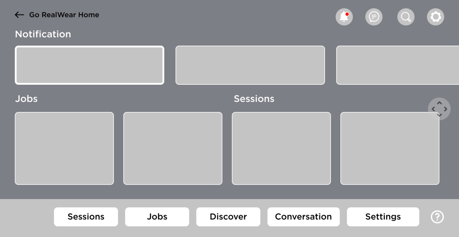
If I was designing purely for RealWear, I would depend heavily on voice commands and head motion as the interaction model for navigating the application. I would also leverage the drawer along the bottom for additional actions per screen.
On Google Glass, voice commands are improving but can still be spotty. As a result, I’d base primary interactions on the touchpad instead of voice commands and would leverage the full screen overlays for access to additional actions or options. Depending on your company’s situation and long-term plans, you may have the resources to optimize these devices individually to create the best experience for the end-user. If not, you may need to rely on the lowest common denominator between them, which in this case would make the touchpad the more advisable mode of primary interaction.
Take a look at our registration screens for RealWear vs Google Glass 2.
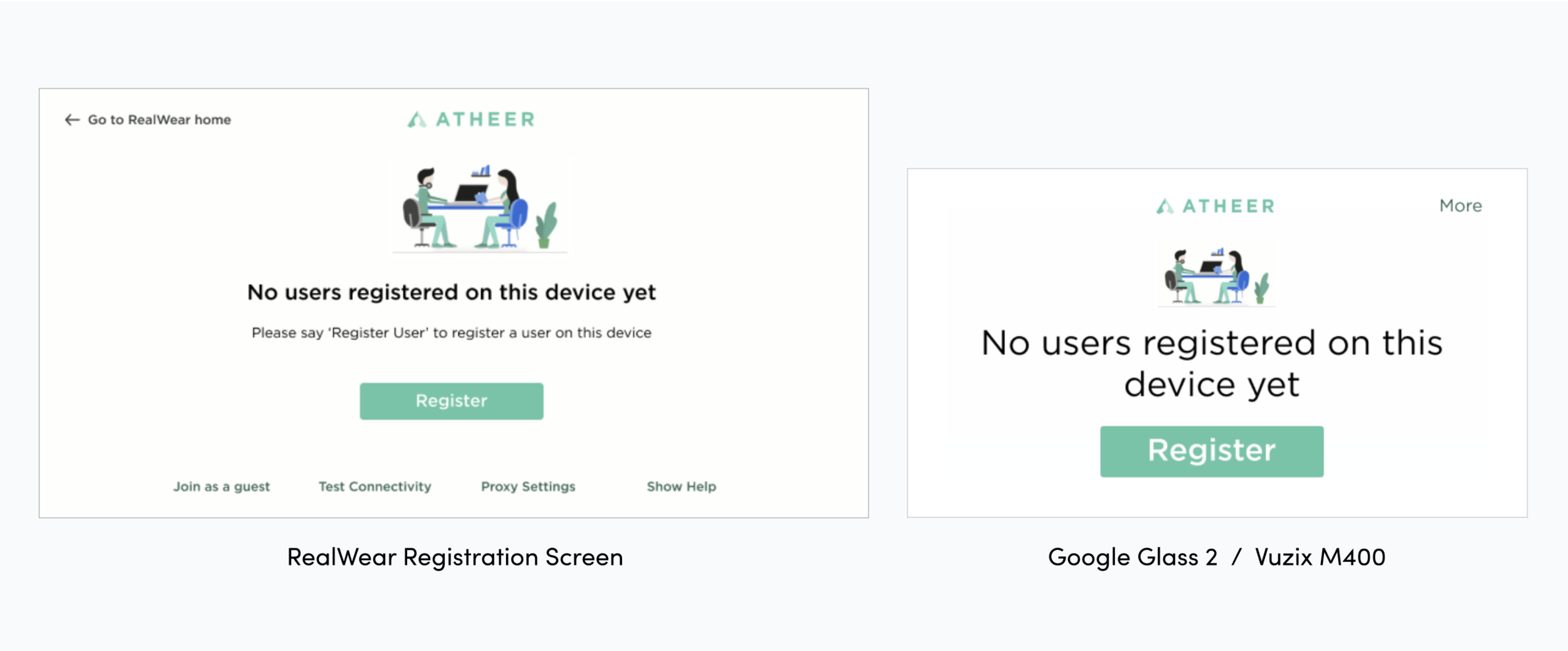
To support RealWear’s “Say What You See” model, you can see how there are text buttons along the bottom of the screen to support easy access to voice commands. Users can navigate using the touchpad, but more likely they’ll say the button label as a voice command – for convenience or for a hands-free experience.
Google Glass and Vuzix’s smaller screens, however, make it difficult to pack all those text buttons in. You could reduce the font size, but this would quickly make the text smaller than ideal for most of our users. As a result, we chose to place these actions in a “More Menu” that opens a full-screen overlay – a common paradigm on Google Glass and Vuzix M400.

2. Scrolling
Scrolling is another example of an interaction puzzle between devices. If your product is originally a mobile app, scrolling is no doubt a fundamental navigation technique you’ll need to account for. If a user is viewing a listing screen on RealWear, we could leverage voice commands and head motion to move through the list. If the user is on a Google Glass or Vuzix device, we would depend on the touchpad – swiping forward/backward for horizontal listings and swiping up/down for scrolling through vertical listings.
3. Scan and Capture Interaction Optimization
As a B2B2C product supporting front-line workers, the ability to capture images, video, audio while performing procedures is critical for compliance and later reference. Similarly, scanning barcodes, QR codes or text (OCR) is important for verification, pre-defined search parameters, or - in the future - the window through which users can experience AR. See my article on how we approached the different camera experiences in our app.

Early on, a pivotal customer planned to deploy on RealWear, so initially we optimized for voice commands as the primary interaction mode. But, this approach didn’t work great on smaller devices like the Vuzix or Google Glass. Luckily, we had a little wiggle room to step back and design around both voice commands and touchpad control, providing a better experience across all these devices. This did mean, however, there was some non-trivial changes to the UI. Since our UI design had revolved around exposing voice commands (Say What You See) to support RealWear, we had to re-think how we presented actions to the user in this experience. Since the primary focus is the camera feed, you want to keep as much of the screen free of UI elements as possible. It’s tricky to fit everything. Here are a few of the routes we explored before finalizing:
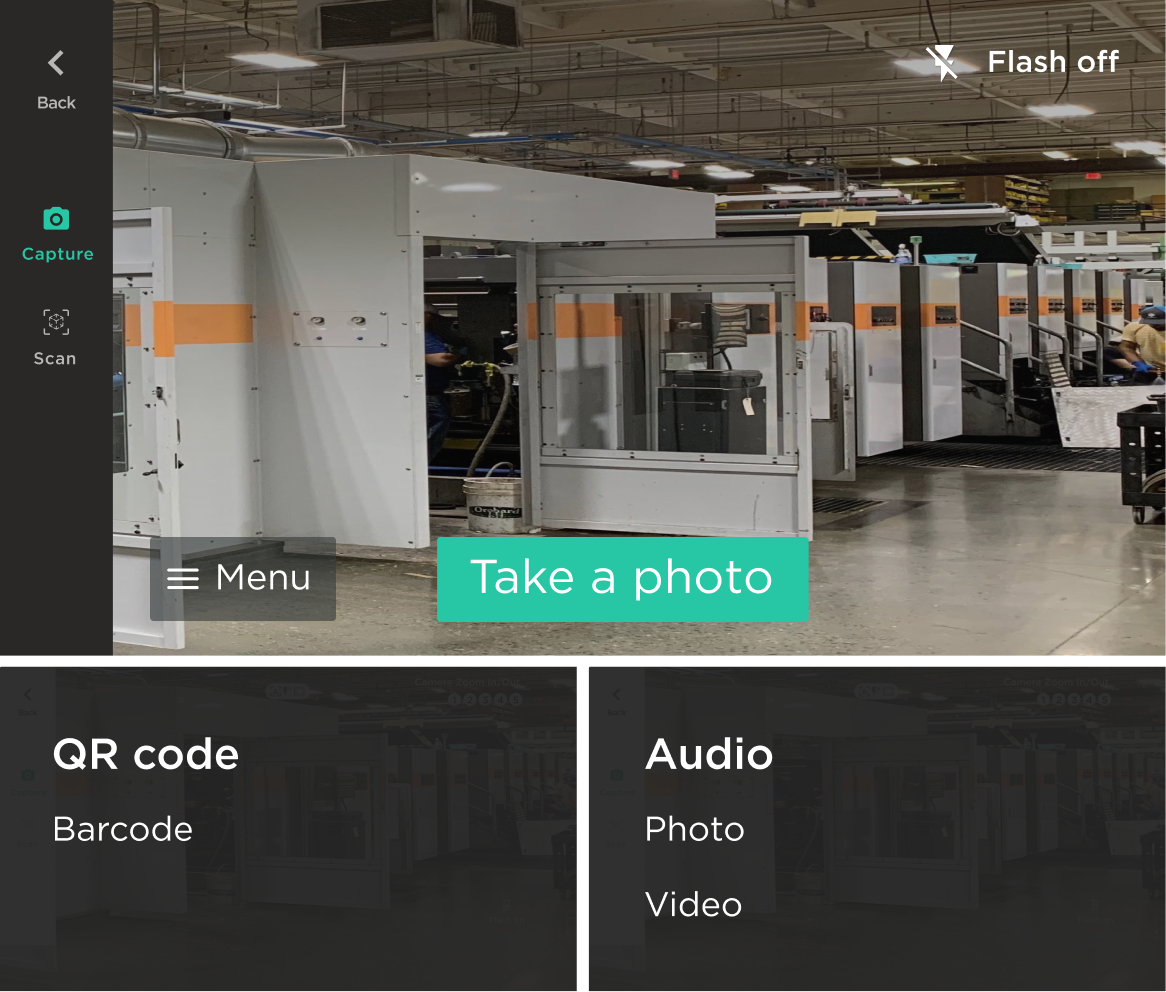
1. Voice Commands
This option is the most similar to the initial design on the RealWear glasses - which made engineering happy 😊. We would keep the left nav exposed to move between modes and then only visually change the selection of submodes. Functionally the experience was the same, but the submode selection on smaller devices would be accessible via an overlay menu, instead of persistently visible on screen.
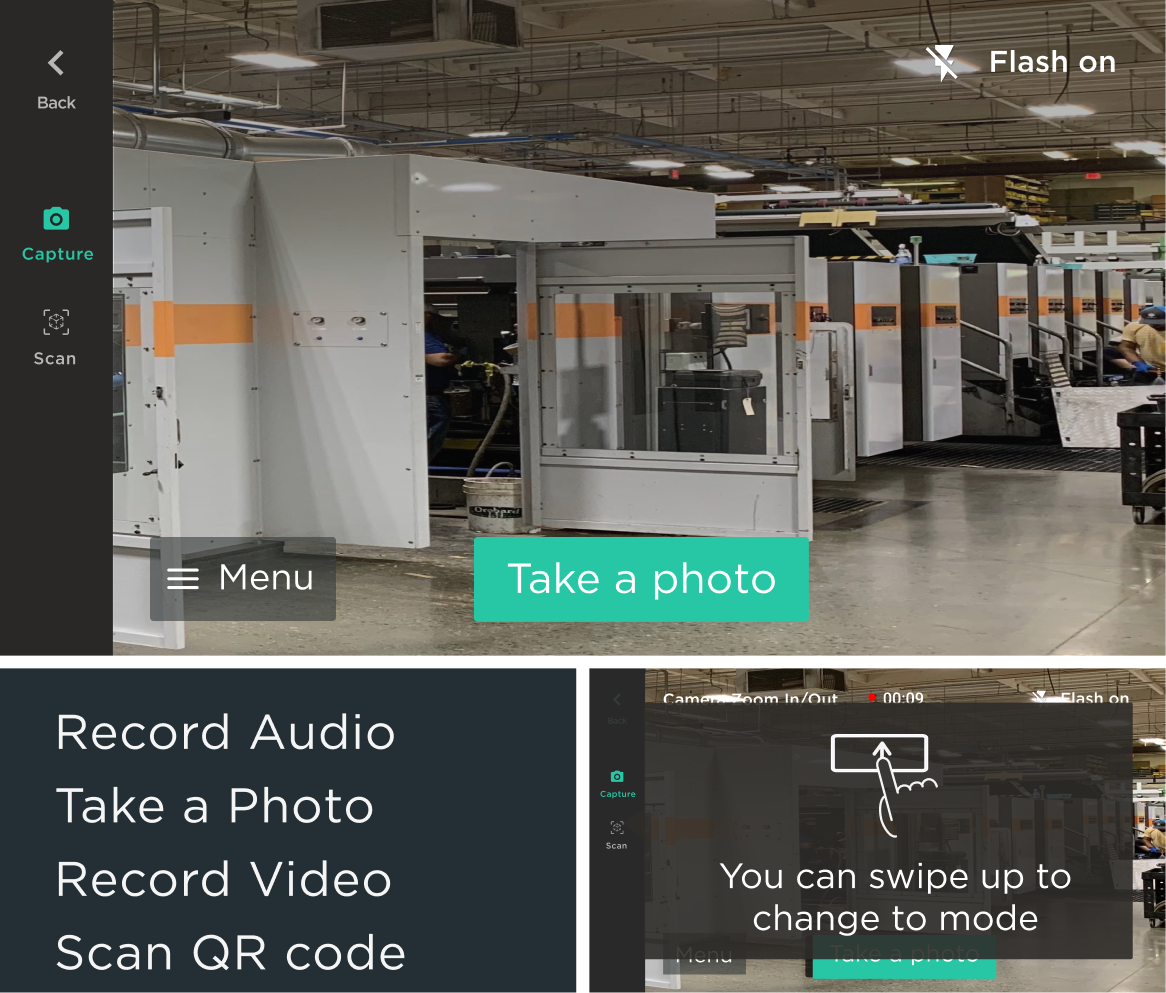
2. Different IA Split
On mobile, this section of our app is split into Scan and Capture, with three submodes each. One option was to not split the actions by high level category and to simply offer all six submodes in a full screen overlay menu. We could also provide a shortcut action using the touchpad to switch between these submodes - all without voice commands. This ultimately had issues with future feature development and scalability since there are other categories of capabilities we knew we wanted to support. Also these kinds of interactive shortcuts would likely require some kind of onboarding or training, which we didn’t have bandwidth for.
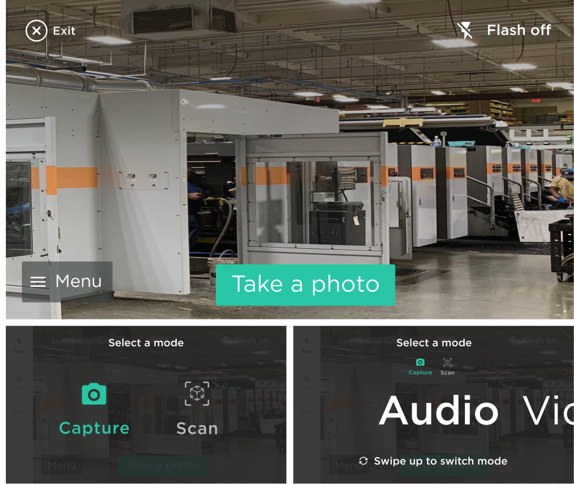
3. Optimize for Viewport
This option optimizes for the largest viewport. The left nav is hidden and menus and submenus are still split conceptually between Capture and Scan. This would allow the user to navigate without any shortcuts, but provide the optionality to build in more efficient interactions/shortcuts over time with voice commands or gestures on the touchpad (e.g. one-finger swipes move users through the high level modes while two-finger swipes move users through submodes).
Keeping actions split by category and providing enhanced interactions (like shortcuts) allowed us to take the best of the RW approach, while also leveraging aspects that optimized for experiences on smaller devices.
Questions I would ask myself to start:
DEVICE SPECS
What device?
Are you designing an app for one monocular device or will your app need to run on more than one?
This will determine screen size, interaction paradigms based on hardware constraints and available inputs
What are the possible interaction paradigms for that specific hardware?
Voice commands, head motion, touchpad gestures?
UX CONSIDERATIONS
Are you optimizing for one device or many
Accessibility
You may find it helpful to create an artboard or canvas and drop in 14pt text. Most likely you’ll immediately grasp the space constraints you’re dealing with. I’ve created a reference Figma file with base screen sizes you can access here.
Define your green zones/red zones (40px is pretty standard for screen padding on monocular devices)
What interaction paradigm are you prioritizing? Can you depend on overflow menus? Do all buttons need to have full voice commands on them? Do voice commands need to be multisyllabic? Does the touchpad support multi-finger interaction? Will you be using head motion?
What absolutely needs to be persistent in the UI (try to keep as strict a list as possible here)
IA CONSIDERATIONS:
Is this a companion app? Standalone? Is security a critical constraint (passcodes)?
These will determine the depth of navigation and IA that needs to be supported
Are your IA bounds clearly defined by an existing mobile app? Is consistency across mobile and wearable experiences important (consistency in terms of IA/user experience/flow, not just brand)
What is your target use case(s)? Are your users tech savvy or hesitant adopters. Do they tend to be older and need larger text? Do they need to navigate this experience with gloves on? Do you need to support a lot of content or will this primarily be used for a specific action (e.g. scanning barcodes to track inventory)? Are you going to need to support long listings or many settings/menus?
How much information/actions do you need persistently available? Do you require a persistent, hovering help (?) button? Does the device have an OS level back button built in or do you need to provide that persistently in the interface?
What are the requirements for authentication / user verification? It would be helpful to think through high level flows since input on glasses is notoriously cumbersome, e.g. in a pre-login, does a user scan a QR code to authenticate? Do you need to support SSO/SAML?
What content types do you need to support? It may be helpful to list out all your content types to understand what interaction method(s) you will want to depend on/what requirements should lead your interaction decisions in content players (e.g. when zooming and panning, does the device have head motion or will you need discrete buttons?).
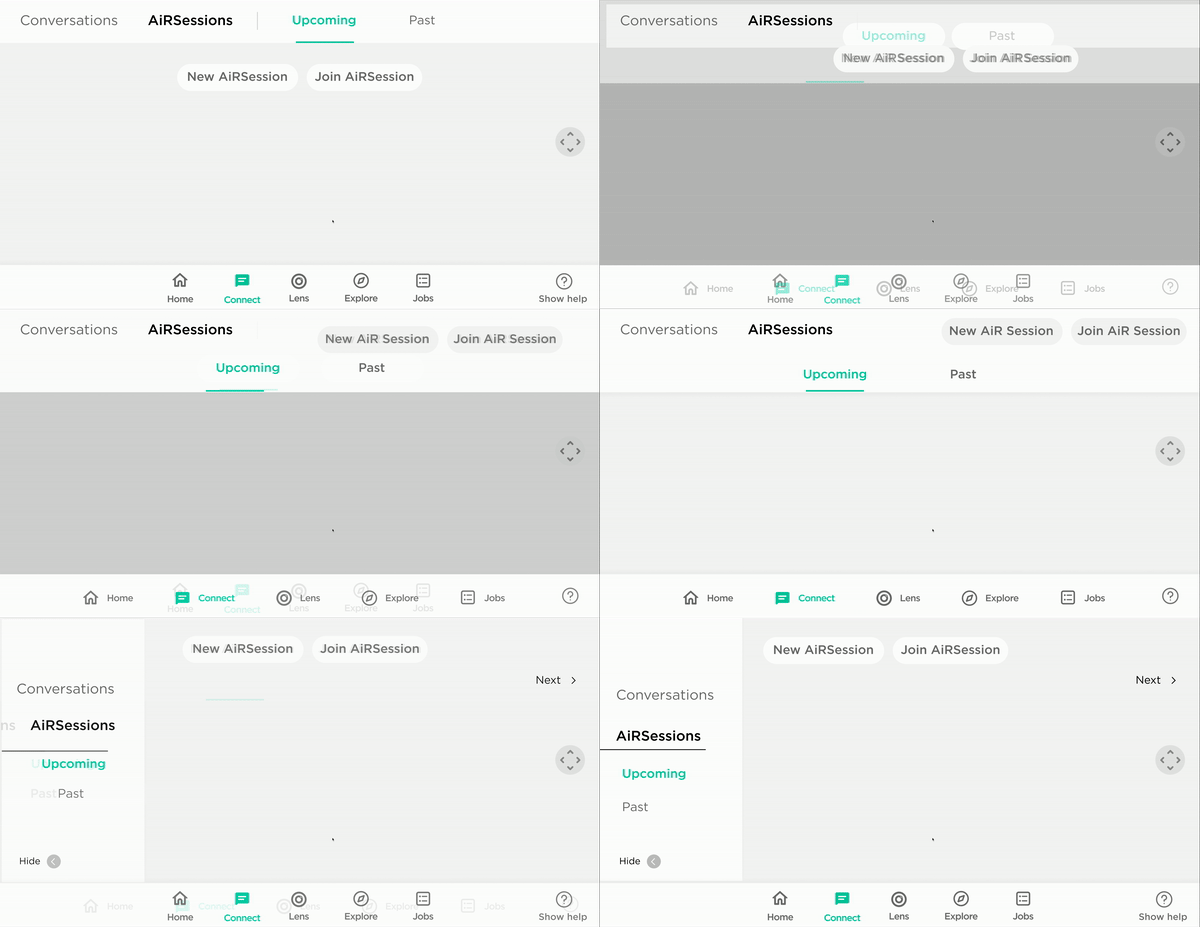
Examples of various approaches we considered for dealing with subtabs
Like all designs, your decisions will likely be subject to other stakeholders, customer requests, etc. You’ll lose a few battles and have to compromise on the experience at times, but hopefully this helps you start strong and also help to articulate why some of these decisions are important to the end-user’s experience and the success of the product.
SOME THINGS TO NOTE BASED ON QUESTIONS:
* These designs are made up of some existing components we’d already made for our mobile apps and based on Material Design (all of these devices run on Android OS) - not only for simplicity but for faster implementation. As a new device and interaction paradigm was already a lot for users - we took advantage of learned behaviors from previous interactions with Android, iOS, etc. wherever we could.
ROLE
Product Designer
TEAMMATES
Maddie West
TIME FRAME
9 months

